Designing RouteVN's Brand Identity
Introduction
Over the past couple of months, we redesigned RouteVN's branding assets, including the logo, app icon, mascot artwork, and website.
This post explains the process behind the redesign and what we wanted to achieve with the new brand identity.
Brand intent
RouteVN is a software application that helps creators, including artists, illustrators, and writers, make their own visual novels.
Because RouteVN is a tool, we wanted to keep the identity neutral and avoid leaning too strongly into one specific taste.
The black-and-white palette represents this neutrality.
At the same time, RouteVN is not just a generic tool. It is built specifically for visual novels, so it should feel relevant to visual novel aesthetics.
It should also feel approachable and friendly to beginners, including students and indie developers who are trying to make their first visual novel.
We wanted the brand to feel simple, elegant, polished, and approachable, consistent with how we want the software itself to feel.
Old design

The old icon attempted to represent choices in a visual novel. Choices are one of the more iconic UI patterns unique to visual novels.
However, because it was designed as black-and-white stroked shapes, it sometimes got lost among other app icons. This was the part I disliked the most about the old icon.
In addition to the old design, we had an idea for a mascot character named Makkuro, meaning pitch black. However, we did not have a strong design for her yet, only sketches and rough illustrations.
Character design
We started the redesign project by properly working on the character design.
Luckily, we had the opportunity to work with a talented illustrator who helped us through this process.
We wrote down what kind of character Makkuro was and what she represented. It was not fully clear even to us at first, but the process forced us to be more explicit about it.
The illustrator asked many questions about the art style, such as whether to use thin or thick lines, and what style of coloring we wanted.
We then spent a lot of time developing Makkuro's outfit. The illustrator was knowledgeable about fashion and suggested several outfits.
So we went through an exploration stage. The focus was to try different things, and we looked online for fashion and outfit references that we could use.
After many iterations and a few full versions, we finally arrived at the character reference sheet.
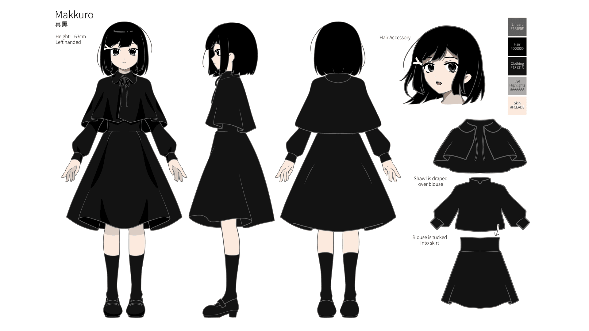
Some notes on the final outcome:
- We made her live up to her name, so we made her hair and outfit fully black. This led us to use non-black lines.
- We stuck with cel shading for coloring. It is less time-consuming than a full render, while still feeling simple and elegant.
- She is left-handed.
- Her hairpin is a small accessory that makes her stand out. The Y shape represents a path branching into two different routes.
After agreeing on the character reference sheet, working on the sprites was very smooth.
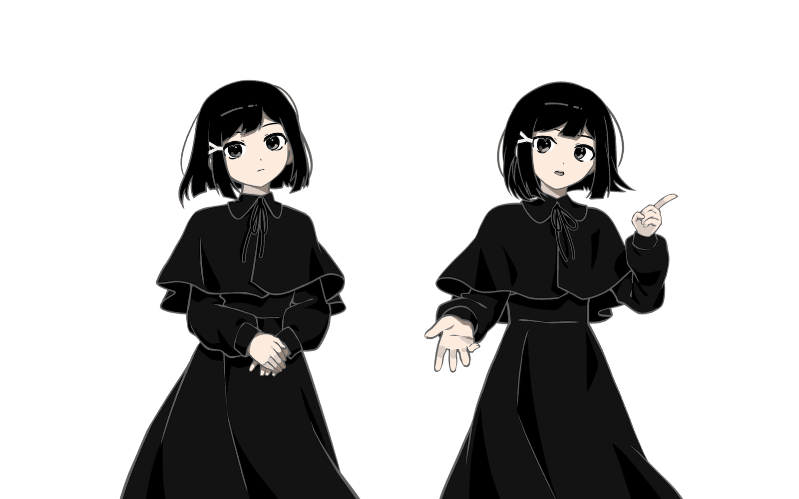
At this point, we had our mascot character, and we were happy with the outcome. Later, a lot of the branding would end up revolving around her.
New icon
At first, we wanted to have a shape-based icon. That felt best for a software tool.
We did try to improve on the old icon.
- We played with the idea of choices, like the old icon.
- We tried to represent routes as a path branching into two paths.
- We explored variations of the letter
rorR.
But none of them really clicked with us. Some candidates were better than others, but they felt too dependent on typography.
In the end, we decided to use the mascot character in the app icon.
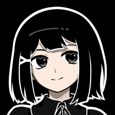
The icon is more opinionated and less neutral than a shape icon, but it better represents what RouteVN stands for, and it feels closer to the actual visual novels that users will create.
The icon still uses black and white, so it keeps the neutrality of the brand.
Cover illustration
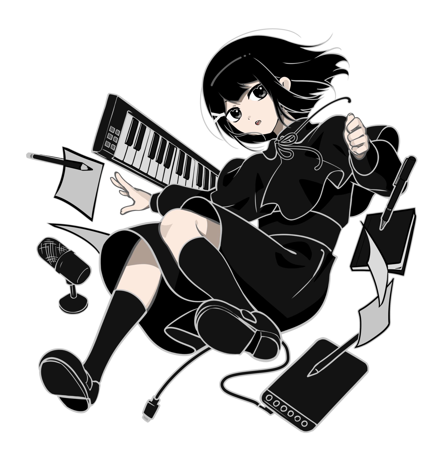
We wanted a strong illustration that could carry this direction, and that we could reuse as a cover illustration in various places.
Besides the character, we needed objects around her so the illustration would not feel empty. The objects in the illustration represent the creative work behind a visual novel.
- Drawing paper and a drawing tablet.
- A pen and notebook for writing.
- An electric piano keyboard for music.
- A recording microphone for voice acting.
We considered adding a computer keyboard for writing, but it reads more broadly as "computer" than "writing". A pen and notebook felt closer to the act of writing stories.
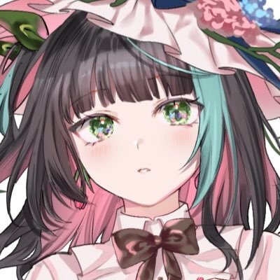
@aiyuuno is the artist who worked on the character design, icon, and cover illustration. I am grateful for the care that was brought to the project.
Text logo
After finishing the icon, we needed a text logo as well.
I didn't know a specific text logo designer, but one day I found a VTuber logo designer whose style felt close to the direction we wanted:
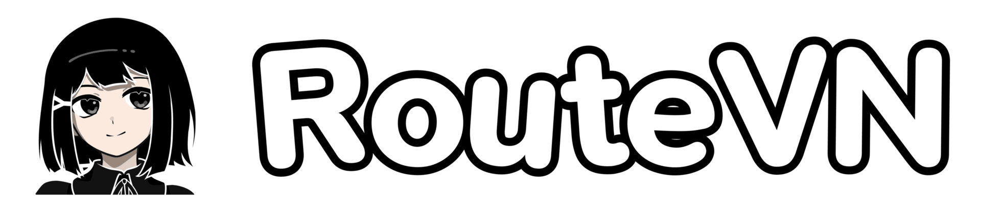
After choosing the designer, we still had to write down all the things we wanted for the logo.
We realized we didn't really have an iconic image other than the character or the Y shape from the hairpin, so we ended up sticking with a simple tilted text.
The black-and-white palette required some attention to make the logo read clearly. We solved this by using two outlines. The inner text is white, then there is a black border, and then another white border.
We looked at different fonts and ended up with a font called SN_Pro. It is a sans-serif font with rounded edges. We played a lot with the font weight.
At one point, we wondered if it was a bit too cute, but we decided to stick with it. The cuteness makes it more approachable, and it fits with the character icon.
@Mikalogo is the logo designer who worked on the RouteVN text logo.
Stickers
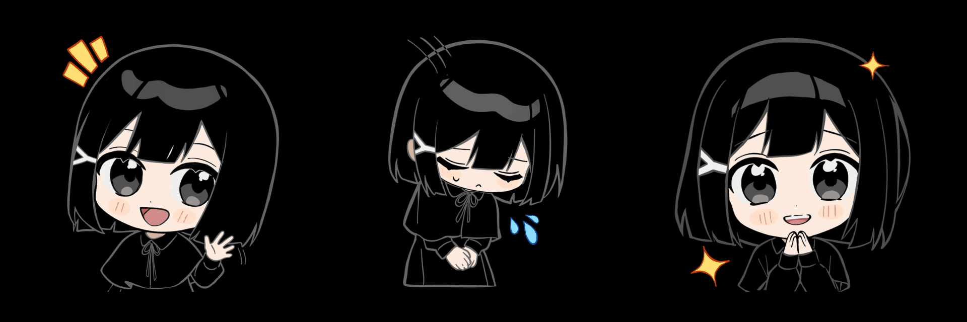
Stickers are fun, cute, easy to share, and easy to reuse in many places.
- We can use them in the RouteVN Discord server.
- We can print them as physical merchandise.
- We can also place them on the website to make pages feel more lively than plain text.
This gives the brand a more playful touch while still keeping the main product identity simple.
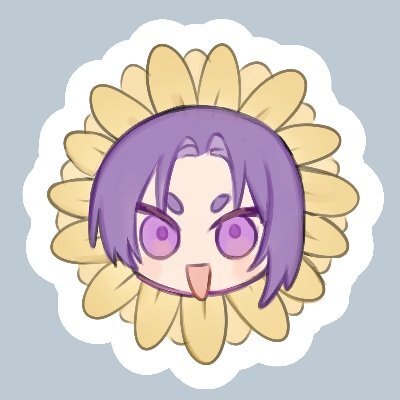
@RE_0rie is the artist who worked on the Makkuro stickers.
Slogan
The slogan is "Bring your Visual Novel to Life".
The idea is that RouteVN Creator helps artists, illustrators, writers, and anyone who wants to make a visual novel actually finish it.
During my time collaborating with artists, I met people who had a story or idea in their head for a long time.
Some had already made illustrations, developed characters, written story concepts, or built a world around their idea.
They became interested in using RouteVN Creator to finally make the story real, and bring it into the world so others could read and see it.
Website redesign
We wanted the homepage to be more memorable, and we decided to focus on helping users feel the brand rather than only giving information.
We decided to keep the first screen focused on the cover illustration and the logo.
To make the illustration more captivating, we separated the character and the objects behind her into different layers. We made them move at different speeds, so you get a sense of movement that also changes when you move the mouse over it.
The rest of the RouteVN Creator about page is a more standard landing page. We added sticker illustrations and object illustrations to make it feel more at home with our branding.
Conclusion
After we deployed the new branding, it became easier to engage with users.
I was especially happy to see many users describe our character as adorable and cute.
That was a good sign that the identity was doing what we wanted. RouteVN still feels like a software tool, but it now has a face, a feeling, and a stronger connection to the visual novel creators we want to support.
I hope you enjoy the new look of RouteVN and Makkuro ^_^