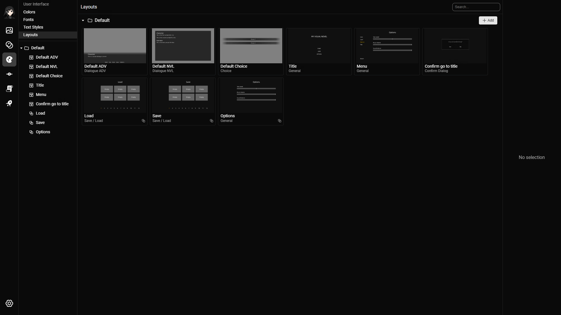
Layouts define reusable UI and presentation structures.
You can combine resources such as images, videos, sounds, character sprites, text, and text styles inside a layout. Layouts are used for dialogue boxes, choice menus, input forms, save/load screens, backgrounds, overlays, and other visual structures.
Creating a layout
Click the add button to create a layout.
You will be asked to fill the following fields:
- Layout name (required)
- Layout type (required)
- Description
- Tags
- Can be used as fragment
The layout type is selected when you create the layout. Choose the type based on where the layout will be used.
Layout types
- General: Flexible layout type for backgrounds, menus, and other all-purpose screens.
- Dialogue ADV: Layout for ADV-style dialogue.
- Dialogue NVL: Layout for NVL-style accumulated dialogue.
- Choice: Layout for player choices.
- Save / Load: Layout for save-slot based save and load screens.
- Confirm Dialog: Layout for compact confirmation prompts.
- History: Layout for dialogue history overlays.
- Input: Layout for player input forms used by the Input line action.
Some features only show layouts with the matching type. For example, the Dialogue line action uses dialogue layouts, the Choices line action uses choice layouts, and the Input line action uses input layouts.
Fragments
A fragment is a layout that can be used as an element inside other layouts.
Use fragments for repeated UI pieces that you want to reuse, such as a common button style or shared panel.
Fragments are similar to components, but you cannot pass custom variables to a fragment.
Layout Editor
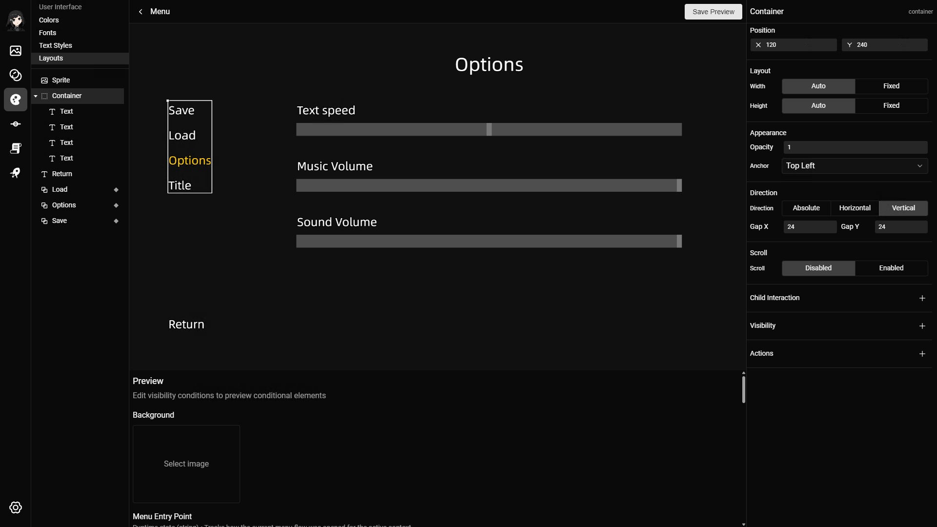
The layout editor is where you place and configure layout elements.
You can use it to:
- Add and position elements.
- Configure text and text styles.
- Use image, video, sound, character, and other project resources.
- Add particle effects and spritesheet animations.
- Add fragments from other layouts.
- Add conditional behavior where supported.
Double click a layout to open it in the layout editor.
Most layout positioning is tied to the project resolution, so use assets that match or are relative to that resolution.
Common Fields
Index
Common fields are shared by several layout element types.
Position
Position controls where an element appears relative to its parent element.
This field is hidden when a horizontal or vertical parent container controls child placement.
Size
Size controls element dimensions.
Some elements support fixed size, while some support Auto or Fixed modes.
Aspect ratio
Aspect ratio keeps width and height in the same ratio when Ratio is Fixed.
Opacity
Opacity controls how visible an element is. Use a value from 0 to 1.
Anchor
Anchor is the point used for positioning, scaling, and rotation.
Values are normalized, such as 0, 0.5, and 1.
Anchor presets are Top Left, Top Center, Top Right, Center Left, Center, Center Right, Bottom Left, Bottom Center, and Bottom Right.
Visibility condition
Visibility condition shows the element only when a condition matches.
Conditions can compare a project variable or supported runtime value with a value.
Actions
Actions are triggered by interaction.
Most elements use click and right click. Sliders use change.
Conditional overrides
Conditional overrides change supported fields when a condition matches.
Supported override fields include text styles, image variants, opacity, anchor, text alignment, and visibility.
Layout Elements
Index
Layout elements are the parts you add to a layout in the layout editor.
Fields can appear or hide depending on the element type, parent container, and layout type.
Container
Use a container to group related elements.
Containers are useful when several elements should move, show, hide, or receive interaction together.
Direction
Direction controls child layout.
Absolute lets children use their own positions. Horizontal and Vertical arrange children in order.
Gap
Gap controls spacing between children when Direction is Horizontal or Vertical.
Scroll
Scroll enables scrolling for overflowing children.
Child interaction
Child interaction lets child elements inherit hover, click, or right click interaction.
Use Absolute direction when children should use their own positions. Use Horizontal or Vertical direction when children should be arranged in order.
Text
Use Text for labels, menu text, button text, and other written content that should appear immediately.
Text can use project text styles so typography stays consistent across layouts.
Text content
Text content is editable text for plain text elements.
Text content can include variables. When the layout renders, each variable reference shows the current variable value.
To add a variable to text content:
- Create the variable on the Variables page.
- Select a Text element in the Layout Editor.
- Click the Content field in the inspector.
- Type
/in the text editor. - Select the variable.
- Save the text content.
The variable appears as a chip in the editor.
Text style
Text style controls default, hover, and click text style variants.
Text alignment
Text alignment controls alignment for this text element.
Sound
Sound is an optional audio cue played on hover or click.
Some layout-specific text elements get their content from runtime data instead of the Content field.
Text revealing elements
Text revealing elements animate text as it appears.
They are different from plain Text elements. Plain Text is best for fixed labels, menu text, and static UI copy. Text revealing elements are used for dialogue content, such as Text (Dialogue Content) in Dialogue ADV layouts and Text (Line Content) in Dialogue NVL layouts.
Reveal effect
Reveal effect controls text revealing behavior.
Supported effects are Typewriter, Soft Wipe, and None.
Click-to-continue indicators
Click-to-continue indicators are configured on dialogue text revealing elements.
Read Dialogue: Click-to-continue indicator for the video and setup steps.
Image
Use image elements for backgrounds, panels, icons, buttons, and other visual assets.
Upload images on the Images page before using them in a layout.
In element data, image elements are stored as sprite elements.
Image
Image is the default image shown by the element.
Image variants
Image variants are optional hover and click images.
When you create an image element, the editor uses the selected image dimensions as the starting size.
Slider
Use a slider when a layout needs a value control, such as a volume or settings control.
Place the slider where the player should interact with it, then configure the value behavior in the layout editor.
Direction
Direction is Horizontal or Vertical.
This is selected when the slider is created.
Slider image
Slider image controls the images used for the slider bar and thumb.
Slider value
Slider value controls numeric slider behavior.
The value can be manual or connected to a runtime value.
Use sliders for settings that need a numeric value, such as text speed, sound volume, or music volume.
Fragment
Use a fragment element to place another layout inside the current layout.
Only layouts with Can be used as fragment enabled can be used as fragment elements.
Fragment layout
Fragment layout selects the layout used as the fragment.
Fragments reuse the selected layout as children of the current layout. You cannot pass custom variables to a fragment.
Layout type specific
Some layout types add special element types. These elements still use the common fields of their base element, but they read specific runtime data for that layout type.
Dialogue ADV
Dialogue ADV layouts can include special text elements for the current dialogue line.
Text (Dialogue Content)
Text (Dialogue Content) is a text revealing element that uses the current dialogue content.
Dialogue content
Dialogue content comes from the active dialogue line. You do not need to type the dialogue text into the layout element.
Reveal effect
Reveal effect controls how the dialogue content appears, such as Typewriter, Soft Wipe, or None.
Text (Character Name)
Text (Character Name) is a text element that uses the current dialogue character name.
Character name
Character name comes from the active dialogue line character.
Dialogue NVL
Dialogue NVL layouts can include special elements for accumulated dialogue lines.
Container (Dialogue Line)
Container (Dialogue Line) repeats once for each accumulated dialogue line.
Dialogue line
Dialogue line data is available to children inside this container.
Text (Line Character Name)
Text (Line Character Name) uses each dialogue line character name.
Line character name
Line character name comes from the current repeated dialogue line.
Text (Line Content)
Text (Line Content) is a text revealing element that uses each dialogue line content.
Line content
Line content comes from the current repeated dialogue line.
Reveal effect
Reveal effect controls how the line content appears.
Choice
Choice layouts can include special elements for player choice items.
Container (Choice Item)
Container (Choice Item) repeats once for each choice item.
Choice item
Choice item data is available to children inside this container.
Choice click action
Clicking this container uses the choice item actions.
Text (Choice Item Content)
Text (Choice Item Content) uses the choice item content.
Choice content
Choice content comes from the current repeated choice item.
Input
Input layouts can include fields and submit areas for the Input line action.
Use this layout type when a scene line needs the player to type text, such as a name or short answer. The Input action can only select layouts with the Input type.
Input-specific elements are available only when the layout type is Input.
Create an input layout
To create the layout used by Input:
- Open Layouts.
- Create a layout.
- Set Layout type to
Input. - Open the layout in the Layout Editor.
- Right click the canvas and add an
Inputelement for each field the player should fill. - Select each Input element and set
Fieldto a short stable field id, such asplayerName. - Add an
Input Submit Containerwhere the player should click to submit. - Add text, images, and styling around the fields as needed.
Field is the layout field id. It is not the variable. You map each field id to a variable in the Input action.
Input
Input is a field where the player can type text.
Field
Field is the layout field id used by the Input action. Use a short stable value, such as playerName.
The field id is mapped to a string variable in the Input action.
Use a different field id for each value the form should save.
Input Submit Container
Input Submit Container is a container that submits the input form when the player clicks it.
Use it for the visible submit button or submit area in the layout.
Save / Load
Save / Load layouts can include special elements for save slots.
Container (Save/Load Slot)
Container (Save/Load Slot) repeats once for each save slot.
Save slot
Save slot data is available to children inside this container.
Pagination
Pagination controls whether save slots are continuous or paginated, and how many slots appear per page.
Save data visibility
Children inside a save/load slot can use whether save data exists as a visibility condition.
Sprite (Save Image)
Sprite (Save Image) is an image element that uses the save slot thumbnail.
Save image
Save image comes from the current repeated save slot.
Text (Save Date)
Text (Save Date) uses the save slot date.
Save date
Save date comes from the current repeated save slot.
Confirm Dialog
Confirm Dialog layouts can include special containers for confirm and cancel actions.
Container (Confirm OK)
Container (Confirm OK) is a container whose click action confirms the dialog.
Confirm action
Clicking this container runs the confirm dialog confirm actions.
Container (Confirm Cancel)
Container (Confirm Cancel) is a container whose click action cancels the dialog.
Cancel action
Clicking this container runs the confirm dialog cancel actions.
History
History layouts can include special elements for dialogue history entries.
Container (History Item)
Container (History Item) repeats once for each history entry.
History entry
History entry data is available to children inside this container.
Text (History Character Name)
Text (History Character Name) uses the history entry character name.
History character name
History character name comes from the current repeated history entry.
Text (History Line Content)
Text (History Line Content) uses the history entry text.
History text
History text comes from the current repeated history entry.
Usages
Layouts are used in different places depending on their type.
General:
Dialogue ADV and Dialogue NVL:
Choice:
Input:
Confirm Dialog:
- Confirm dialogue.